16 plotly
- plotly paketi ile interaktif grafikler elde edilmektedir.
- 🔗 PISA ve TIMMS dataları ile elde edilen interaktif grafikleri linkten inceleyebilirsiniz.
16.1 Bar
-
mtcarsveri setini kullananarak basit bir bar grafiği elde edelim. X ekseni silindir sayısıcyl, Y ekseni ise her bir türün frekans değerini göstersin.n
- silindir sayısı
table(mtcars$cyl)##
## 4 6 8
## 11 7 14- Öncelikle ggplot ile çizelim.
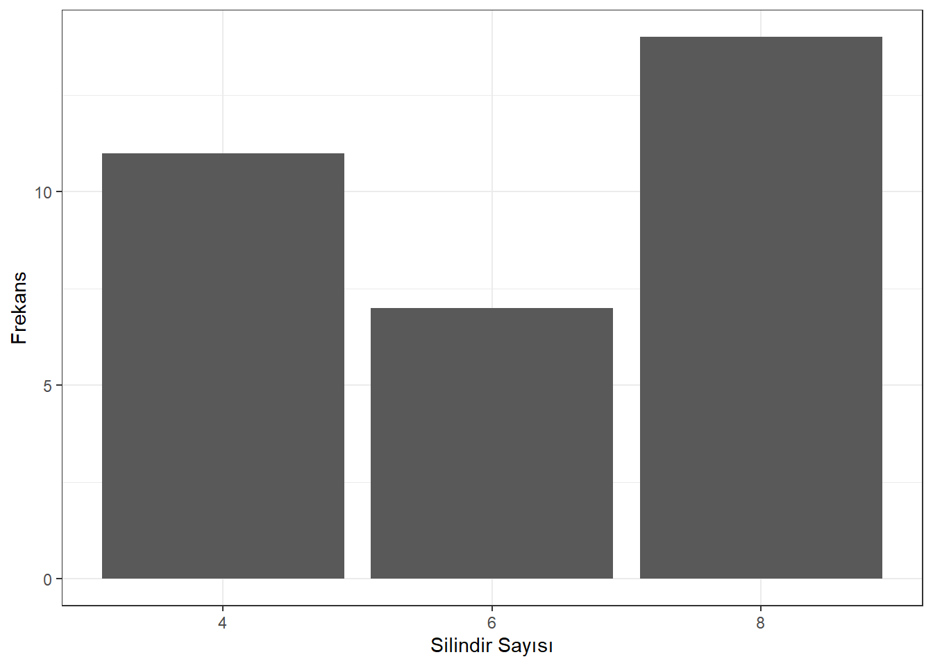
Figure 16.1: Silindir Sayısı Frekans Grafiği
- grafiğin ineraktif hali
Figure 16.2: Silindir Sayısı Frekans Grafiği
16.2 Plotly
- Plotly ile grafikleri nasıl çizeceğiz?
- ggplotta + yerine plotlyde %>% kullanılıyor, değişkenler ~ ile tanımlanıyor
bar1 <-  mtcars %>%
  mutate(cyl = as.factor(cyl)) %>%
  count(cyl) %>%    # Frekans tablosu oluştur
  plot_ly(x=~cyl,
          y=~n,
          color=~cyl) %>%
layout(title="mtcars veri seti ile örnek bar grafiği",
         xaxis = list(title="Silindir Sayısı "),
         yaxis = list(title = "Frekans"))
bar1- Bar genişliğinin ve eksen adlarının değiştirlmesi
- eksenlerin değiştirilmesi
mtcars %>%
  mutate(cyl = as.factor(cyl)) %>%  # convert cyl to categorical variable
  count(cyl) %>%  ## count to get the frequency table (from dplyr package)
  plot_ly(y=~cyl,
          x=~n,
          color=~cyl,
          text = ~n,
          ## below 3 lines for the bar label and hover text
          textposition = "outside",
          hovertext = ~paste("No. of cyl=", cyl, "\n", "Count=", n),
          hoverinfo = "text") %>%  # apply plotly on the frequency data
  add_bars(width=0.2) %>%  # use the width argument to adjust the width of the bars
  layout(title="mtcars veri seti ile örnek bar grafiği",
         yaxis = list(title="Slindir Sayısı "),
         xaxis = list(title = "Frekans"))
İki kategorik değişken ile bar grafiği
mtcarsveri setini kullananarak basit bir bar grafiği elde edelim.X ekseni silindir sayısı
cylve vites türüne göre gruplandırma ileamY ekseni ise her bir türün frekans değerini göstersin.
n
| cyl | am | n |
|---|---|---|
| 4 | 0 | 3 |
| 4 | 1 | 8 |
| 6 | 0 | 4 |
| 6 | 1 | 3 |
| 8 | 0 | 12 |
| 8 | 1 | 2 |
- ggplot ile
ggplot(mtcars %>%
  mutate(cyl = as.factor(cyl),
         am = as.factor(am)), aes(cyl)) + geom_bar(aes(fill = am))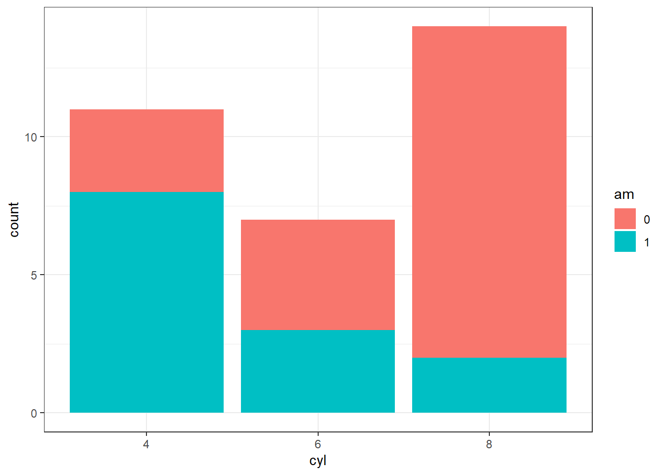
- plotly ile
bar2 <- mtcars %>%
  mutate(cyl = as.factor(cyl),
         am = as.factor(am)) %>%
  count(cyl, am) %>%
  mutate(am=recode(am,
`0`= "Otomatik", `1`="Manual")) %>%
    plot_ly(x=~cyl,
    y=~n,
  color=~am)
bar2- İki kategorik değişken ile bar grafiği barmode="stack"
16.3 Histogram
- Sürekli değişkenle histogram çizimi
-
diamondsveri setindepricedeğişkeninin histogramı
ggplot(diamonds,
      aes(x=price)) +
  geom_histogram(bins=25) +
  theme_bw() +
  xlab("Ücret") +
  ylab("Frekans")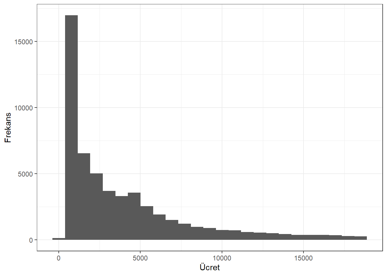
hist1 <- diamonds %>%
  plot_ly() %>%
  add_histogram(x=~price)
hist1 - Histogram çubukları arasına boşluk
hist2 <- diamonds %>%
  plot_ly() %>%
  add_histogram(x=~price) %>%
  layout(bargap=0.1)
hist2 - Çubuk sayısını ve rengini değiştirme
hist3 <- diamonds %>%
  plot_ly(x=~price) %>%
  add_histogram(nbinsx = 50, color=I("green")) %>%
  layout(bargap=0.1)
hist3- Çubuk aralığı belirleme
hist4 <-
diamonds %>%
plot_ly() %>%
add_histogram(x=~price,
xbins = list(start=0, end=20000, size=2000)) %>%
layout(bargap=0.1)
hist4- Kategorik değişkenin histogramı/bar grafiği
hist5 <- diamonds %>%
  plot_ly() %>%
  add_histogram(x=~cut)

hist5- İki kategorik değişkenin histogramı
hist6 <- diamonds %>%
  plot_ly() %>%
  add_histogram(x=~cut, color=~clarity)

hist6
16.4 Çizgi Grafiği
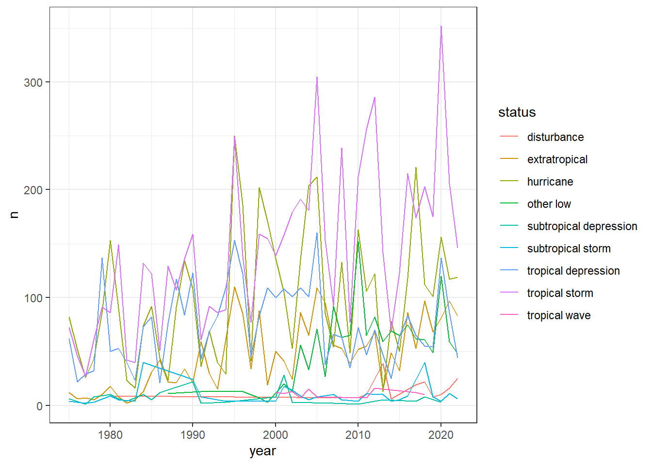
- 1975 -2020 yılları arasında fırtına türlerini içeren
stormsdata setini kullanarak yıllara göre fırtına türlerinin gözleneme sayıları
| year | status | n |
|---|---|---|
| 1975 | extratropical | 12 |
| 1975 | hurricane | 82 |
| 1975 | subtropical depression | 6 |
| 1975 | subtropical storm | 4 |
| 1975 | tropical depression | 62 |
| 1975 | tropical storm | 72 |
16.5 Çizgi Grafiği
ggplotly(cizgi1)16.6 Çizgi Grafiği
## Warning in RColorBrewer::brewer.pal(N, "Set2"): n too large, allowed maximum for palette Set2 is 8
## Returning the palette you asked for with that many colors

## Warning in RColorBrewer::brewer.pal(N, "Set2"): n too large, allowed maximum for palette Set2 is 8
## Returning the palette you asked for with that many colors
16.6.1 Kutu Grafiği
- ggplot ile
kutu1 <- ggplot(diamonds,aes(price)) +
  geom_boxplot()
kutu1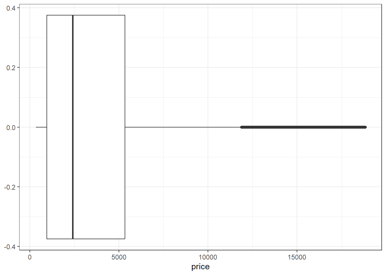
- plotly ile
kutu2<-  diamonds %>%
  plot_ly()  %>%
  add_boxplot(x=~price,
  boxpoints = "outliers")
kutu2
16.7 Grafik Birleştirme
- Grafik birleştirme işlemi
subplot
hist <- diamonds %>%
  plot_ly() %>%
  add_histogram(x=~price)

kutu <- diamonds %>%
  plot_ly()  %>%
  add_boxplot(x=~price,
  boxpoints = "outliers")

comb <- subplot(hist, kutu , nrows = 2,
        shareX = TRUE) %>%
  hide_legend()

comb
16.8 Hareketli Saçılım Grafiği
## tibble [1,704 × 6] (S3: tbl_df/tbl/data.frame)
##  $ country  : Factor w/ 142 levels "Afghanistan",..: 1 1 1 1 1 1 1 1 1 1 ...
##  $ continent: Factor w/ 5 levels "Africa","Americas",..: 3 3 3 3 3 3 3 3 3 3 ...
##  $ year     : int [1:1704] 1952 1957 1962 1967 1972 1977 1982 1987 1992 1997 ...
##  $ lifeExp  : num [1:1704] 28.8 30.3 32 34 36.1 ...
##  $ pop      : int [1:1704] 8425333 9240934 10267083 11537966 13079460 14880372 12881816 13867957 16317921 22227415 ...
##  $ gdpPercap: num [1:1704] 779 821 853 836 740 ...
16.9 Saçılım Grafiği
- 2002 yılı için
LifeExp ~ gdpPercapilişkisi
library(gapminder)
sacilim1 <- ggplot(gapminder %>%
  filter(year==2002), aes( x=gdpPercap, y=lifeExp)) +
  geom_point()+theme_bw()
sacilim1 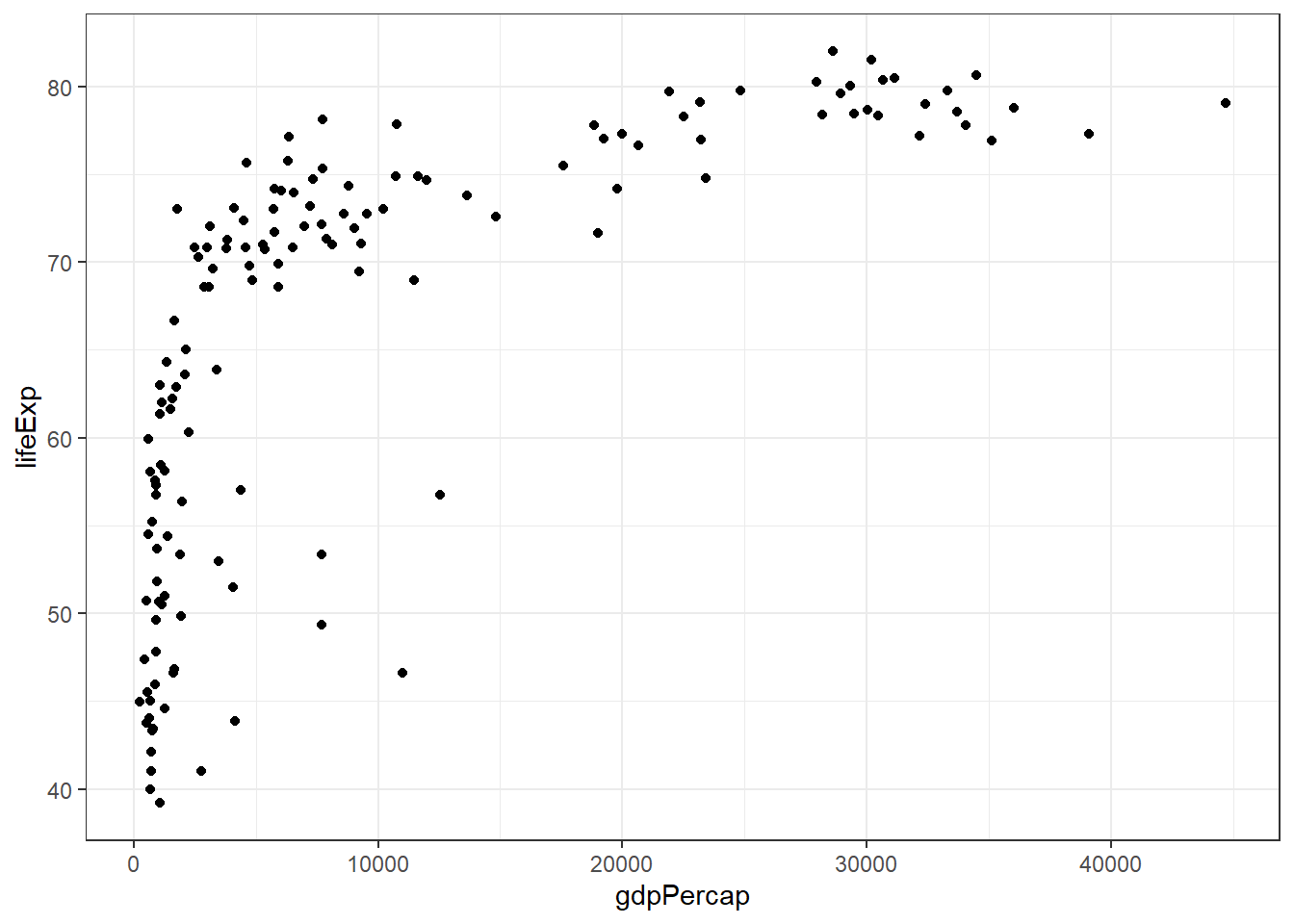
ggplotly(sacilim1)
sacilim2 <- gapminder %>%
  filter(year==2002) %>%
  plot_ly() %>%
  add_markers(x=~gdpPercap, y=~lifeExp) %>%
  layout(title="Plotly SSaçılım Grafiği",
         xaxis=list(title="Kişi Başına
                    GBT(log ölçeğinde)", type="log"),
         yaxis=list(title= "Bekelenen Ömür")) %>%
  hide_legend()

sacilim2- Frame argümanı ile aynı grafiği farklı yıllar için elde edebiliriz.